Kitchen Material Previewer
Pick a floor, pick a wall, watch the kitchen change — 20 finish combinations composited from 9 image layers, no 3D engine involved.
 HTML
HTML CSS
CSS JavaScript
 SketchUp
 Photoshop
 Cloudflare
 Git
Git GitHubPersonal Project
Overview
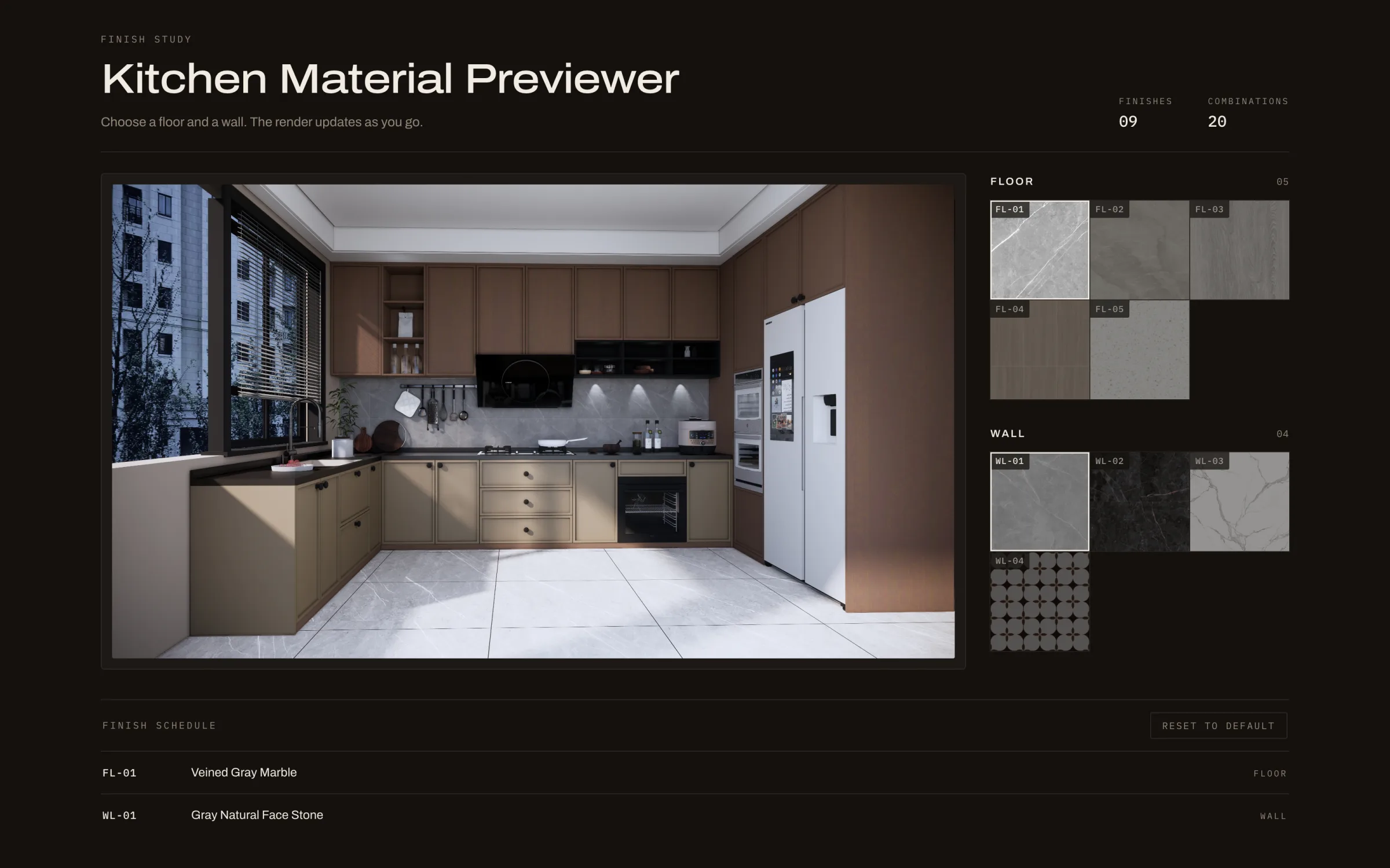
A single-page material previewer for a kitchen render: choose one of five floors and one of four walls, and the room updates instantly. Instead of rendering twenty images, one 4K base render is overlaid with pre-masked PNG layers, so every combination costs nothing but an image swap. Built as three files of vanilla HTML, CSS and JavaScript — no framework, no build step, no dependencies.
Swatches don't sell a room
Handing someone a 100 mm tile sample and asking them to picture a whole kitchen is asking a lot. The grain reads differently at floor scale, the wall colour shifts under the pendant lights, and the two finishes have to live with each other. What people actually want is to see the room — their room — wearing the material. This is a small answer to that: nine finishes, twenty combinations, one click each.
Layers, not re-renders
Twenty combinations could mean twenty 4K renders — hours of render time and hundreds of megabytes to ship. Instead the kitchen is modelled once in SketchUp and rendered once at 3840×2160, then dressed with nine transparent PNG overlays, each cut in Photoshop so the material already carries the room's perspective, its shadows and the light falling across it. Swapping a finish is just swapping one image source: the floor layer and the wall layer stack over the base, so the two choices are fully independent and any pairing works without a single extra asset. Nine images cover what twenty renders would have.
Reading like a finish schedule
The interface was rebuilt to look like the document this actually is: a finish study. A title block up top carries the count of finishes and combinations. Every sample is stamped with the code the trade already uses — FL for floor, WL for wall — and the same codes reappear in a finish schedule at the foot of the sheet, so what you see and what you would specify are one and the same. Monospace for codes, a wide grotesque for the title, warm off-black throughout, and colour reserved entirely for the materials.
The details that make it feel instant
All eighteen assets — nine swatches and nine layers — are preloaded on first paint, so the first click is as fast as the tenth and no finish ever appears half-drawn. A short sweep animation covers the swap so the change reads as deliberate rather than as a flicker. Your selection is written to localStorage and restored on return, because people come back to compare. Samples are real focus targets with an aria-pressed state and Enter/Space handling, a failed image marks its own sample unavailable instead of leaving a blank tile, and the reduced-motion preference turns the animation off. Stylesheet and script URLs carry a version query so a redesign never lands on top of a stale cache.
Three files, no build step
index.html, styles.css, script.js — about 1,100 lines between them, no framework, no bundler, no package manager. The material catalogue is one object at the top of the script, so adding a finish means dropping in two images and adding an entry; the counts in the title block and the sample trays follow on their own. The layout is CSS grid with breakpoints at 1080, 760 and 440 pixels, collapsing from a three-part sheet to a single stacked column. It deploys to Cloudflare as plain static files, which is the whole point: a page like this should still open in ten years.